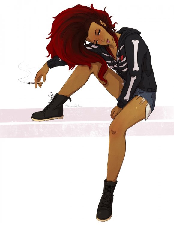
PhantasmicDream
-
Posts
2,141 -
Joined
-
Last visited
-
Days Won
147
Everything posted by PhantasmicDream
-

Reach the highest number without a MENTOR posting
PhantasmicDream replied to Trololiver112's topic in Civilian's Days
Three. -
Shading and Lighting What can make or break a piece. The number one thing that most artists will say is to never shade with black, which they don't necessarily mean this... But more like this. Which can make a drawing look muddy, plain, or boring looking when dealing with wrong, but some people can pull it off I'm sure. What are the different types of shading you may be wondering to yourself, well pretty much you have the two "Cell Shading" which you'd probably see in most media's like TV shows. Then there's "Blending" which you'd see in more painter like arts or maybe even promo drawings. How you pick the right colour for this? Well with the "Cell Shading" you may be finding yourself playing around with the different options for a bit. Personally I go for a dark reddish-purple set to Multiply then play with the opacity for a bit. But the Multiply option for layers will generally make any colour you have on that layer darker. So play around till you find something you like. With the more "Blending" choice, younger/beginner artists makes the mistake of choosing the colour then going straight down for the darker shade. Which in that case makes the drawing look "muddy" would be kind of similar to shading with black. Instead you'd want to move on a downward angle, sometimes changing the colour hue may help. For the example piece, I made the darker shade for the hair a bit for red-orange instead of making it a darker orange. Light is kinda of similar to shading. Where you can have a layer set to Overlay, and use lighter colours to highlight with. Personally I go with yellows, but again play around with colours (and even some of the other layer changing options, Overlay is just a normal go to) With "Blending" with highlights can be similar to the shading, but you'd go on an upward angle. Adding a sort of "filter" layer over the whole piece could harmonize the piece... Especially when you have a lot of different colours going on. But you ca also use this to help you get better "Night Scenes" using dark colours like blues or purples with Multiply. You can even add in a light source have place an overlay/lighten/screen/ ect. layer over that with a lighter colour. I don't have anything about the "Gradient Tool" because the program I use doesn't have it... and wouldn't know what to say about it. RiP Having a light source. Well not all drawings need to have dramatic lighting, and could be basic "room lighting" it's good idea to figure out a light source for you more dynamic pieces. Depending on what the lighting source is, it can make a huge different on how the piece will be shaded. If the light is from behind the character will be covered in mostly shadows. If the light source is small, it could be really bright around the light but very dark everywhere else. This may involve looking up references on how these shadows will fall on people, or trying to create your own references. ^^' Bonus For the people who like this thing that I do when drawing characters! lol I normally do "Cell Shading" but I do this first before any shading to the drawing!!
-
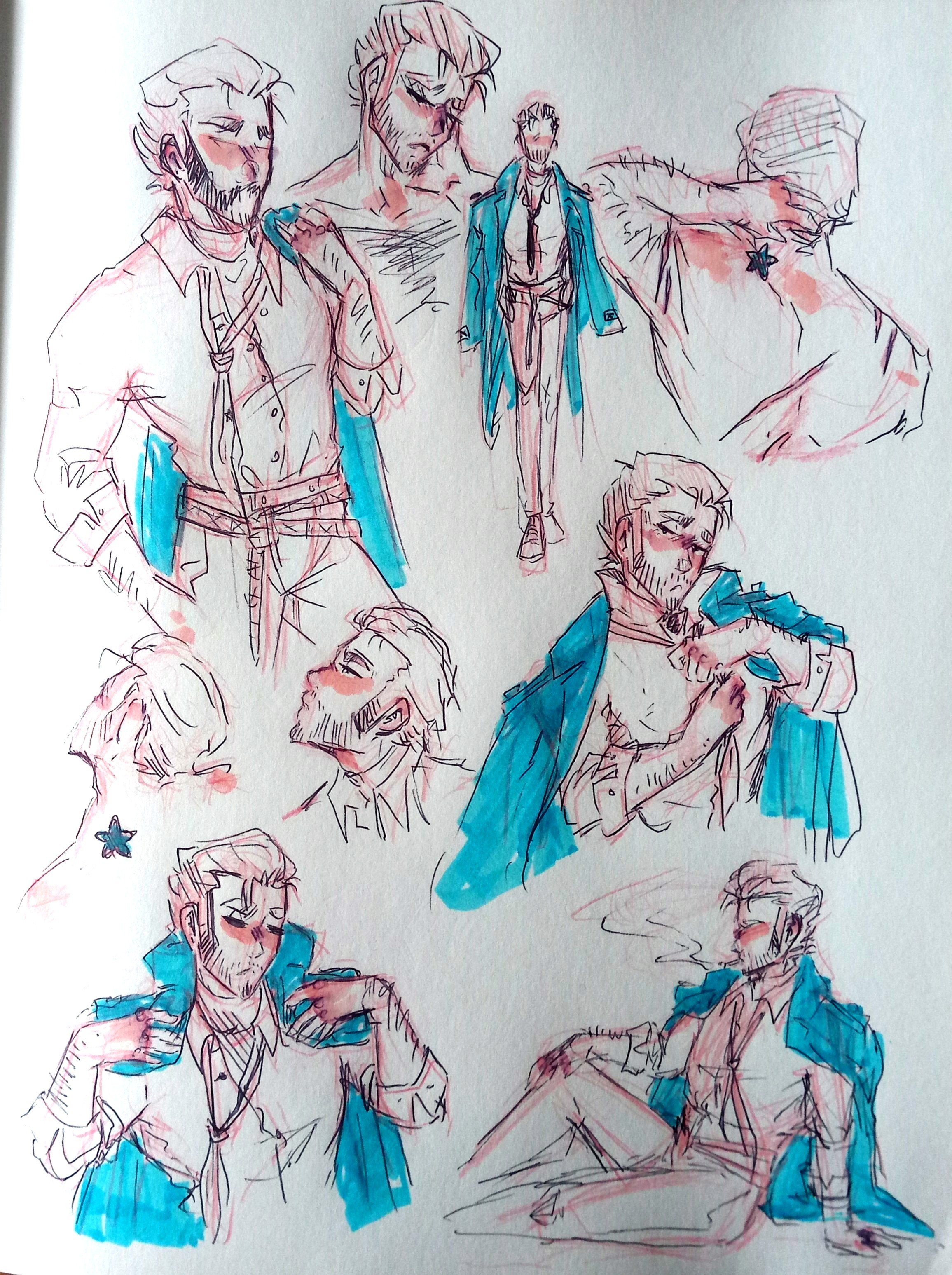
I enjoy doing redraws, and with a small change to space law that happened... Why not draw Jonah in a magistrate outfit again. Here's the original one from a few years ago? Either 2015 or 2016 I can't remember.
-
Is this pixel art I see? I adore
-
Would be great to see you add some things here (everyone is ofcourse welcome to share things too) UwU
-
I'm pretty sure all artists are lazy! Lol
-
Reach the highest number without a MENTOR posting
PhantasmicDream replied to Trololiver112's topic in Civilian's Days
One -
I haven't been doing a lot of digital art lately, which is unfortunate. But I have been doodling in my sketchbook! Because I gotta draw constantly, it's all I known lol. So, me and my habits of creating AUs (alternate universes) I started up a new one for fun and the lols which is a JoJo's Bizarre Adventure AU. In a sort of semi current time maybe? We have Jonah Joestar, and Zeke being a human as Ezekiel "Zeke" Zeppeli. And they both don't know how to wear coats properly, but that's okay! Im still working out their stands, currently Jonah's stand is "Head Games" being illusion based while Zeke's is "One Night" or "One Night Stand" which would be dealing with alcohol... Because he gotta keep up with that Bartender motif? ^^' also, thinking of how I'd want to blend the use of hamon in this as well... This is all still in the WiP stage. Has other people thought of things like this? Feel free to share your ideas of what you think your character's stand would be and such!


-
Nyahahahaa I do hope whoever looks at this section has been finding these posts helpful! I'm not always the best at explaining everything thing. ^^'
-
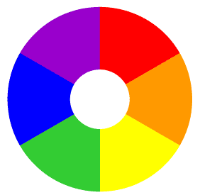
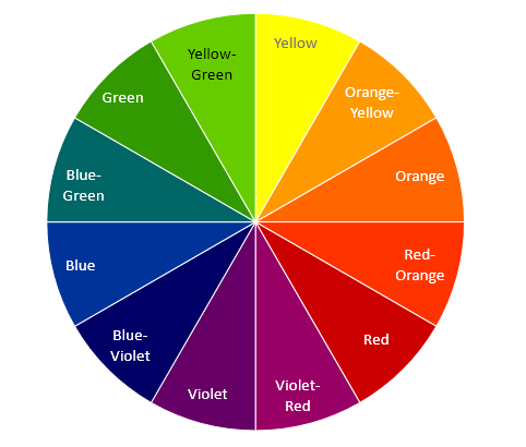
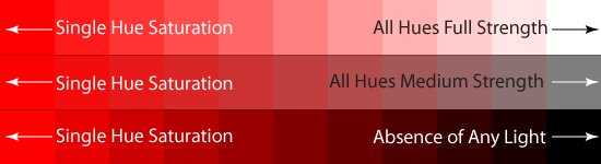
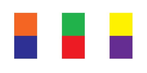
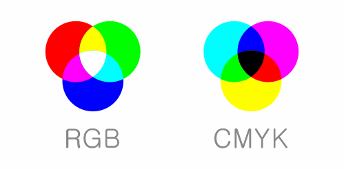
Colour Theory something Artist should know but most artist don't really care too much to know about it. But what is the purpose of colour theory? Basically to know what colours go well with each other, and how to use them to portray a mood you're setting. Primary Colours: Red, Yellow, Blue Secondary Colours: Orange, Green, Violet Tertiary Colours: Orange-Yellow, Red-Orange, Violet-Red Blue-Violet, Blue-Green, Green-Yellow Hue Saturation - This would be colour before adding any lights or dark. Most of the time you wouldn't use all of your colours in full saturation as it can sometimes be straining on the eyes, plus they don't always look well together. Complementary Colours- If they're opposite from the from each other on the colour wheel, they'll probably go well with each other Red - Green Yellow - Purple Orange - Blue RGB - Red, Green, Blue This is what the internet and computer normally uses CMYK - Cyan, Magenta, yellow, Black This is what printers normally uses Colours and Meanings Colours can a many sorts of meanings, and can make people feel things. So here's some examples that I took from my old book from college, "Color Workbook" by Becky Kornig. Of course these colours can also mean other things to different people and regions. Red- Blood, Martyrdom, Sin, War, Anger, Fire, The Sun, Sexuality, Evil, Fertility, masculinity, Festivity Yellow- Treachery, Cowardice, Light, Truth, Warning, Cheerfulness, Spirituality, the Sun, Gold, Radiance, Earth Blue- Heaven, The celestial sphere, Water, Baptism, Space, Coolness, Eternity, Faith, Serenity, Wisdom, Feminine Green- Spring, Resurrection, Envy, Holiness, Charity, Regeneration Black- Death, Evil, Darkness, Void, Witchcraft, Sadness, Mourning, Time, Rebirth White- Light, Air, Purity, Marriage, Death, Redemption, innocence, Surrender Picking colours Picking colours can be a tough thing to do, figuring out which would go well with what and do on. There's a few ways you could approach this, you could stick with the complementary colours what were mentioned earlier. You could stick with picking all cool colours (Blue/Green/Purple/) or all warm colours (Red/Yellow/Orange). Similar to the previous point but picking one colour then having the two colours that would be beside it on the colour wheel for example if you picked Green you'd be using Yellow and Blue. These would give a more "Harmony" look to picture rather than having a contrast. But why not both? In this case you could have two colours that would be more "Harmony" so for an example having Blue and Purple then for your contrast you could pick Orange or Yellow. Drawing a full scene, what ever you may want to pop out of the piece the most should be the complementary colour to your dominating colour. Green character over a mostly red to orange background. Sometimes you have to play around a bit with colours too. Limiting your colour palette can be a tough thing to do, but it can be really helpful with get a solid character design. Figure out what you want for your main/dominating colour. Then plan around that. My character Dreamy has two dominating colours, Blues and Purples, and have the accent colour of yellow. Play around with the saturation, however having all your colours being high in saturation can make it hard to find the focal point as all the saturated colours are trying to grab your attention. This is when you have to get your different values in, looking back at the hue chat from earlier. Even though there's different colours, they can share a similar value and if all your colours are sharing it, it'll make for a vary flat and boring piece. If you're worried about that just make a copy of the piece and turn it to grayscale (art programs and even phone's image editors should give you the option to make something grayscale). There's nothing wrong with having a lot of colours on a character, but keep in mind that it could/will make the character's design look too busy. Some people don't bother or think too hard about this, and just use mostly grays and blacks while having a single colour in it. Most common is Black and Red one could say it's been over done... Using neutral colours can be really helpful if you're having a hard time trying to figure out what you'd like. Grays, Whites, Blacks, and even Browns can be a life saviour!! In relation to the previous post, look at other artists!! See how they approach the use of colours, because at the end of the day you're not stuck with having to do what I mentioned here. and a good example of use of colours is the Anime JoJo's Bizarre Adventure. Were they have plenty of moments where they just play around with colours, not staying grounded to "real word logic" •Maybe art would be easier if everything was just black and white•
-
Art Style And my personal hot take, don't get too caught up thinking about it. You may be finding yourself in a dire need of having an "Art Style" or thinking what is my "Art Style" and that's okay we all go through thinking about this. But a main thing to remember is that what ever you're creating from your own hands will most likely be that "Art Style" However, maybe you're thinking that you have an inconsistent "Art Style" that everything you're drawing looks way different than what you drew before. Well, that's just natural progression, when you're still a new artist or still in the learning stages of art your style will change. But why does it change? It changes because you have picked up the ability to add new ideas/concepts to your art, and you're probably just unaware of it. You're exposed to many different things and art every day and maybe you see something you like and mentally think you're like to try that some day (or maybe not?) and subconsciously you're adding these new elements to your art. Your art style doesn't have to be a permanent thing, and it should be growing along with you on your art journey. Everyone goes through an anime style phase... right? Where do you want your art to go? A question you could start asking yourself. What things inspire you, and do you want your art to represent these things? If you like cute and soft things, your style will probably look more soft and flowy. If you like comics or edgy things(?) you style may take up a more rough look to it. If your a fan of anime or manga, your style may take aspects from the different shows/books you liked. But, maybe there's more to it? Maybe you've been doing the ground works for a while, have an idea of where you'd like your art to go but want some elements to change? Steal like an Artist. A saying, you may or may not have heard before. We're at a point in time where nothing is truly "original" but more of a bastard child of the many things you like. Take inspiration from artists you like, go and study the things they do, then try to adapt that into your own work. Maybe your like the way one artist draws eyes, and how another draw hair? @Drakeven doesn't know that I just used her art for an example. The key thing when doing this is to take elements from a bunch of different artist, don't take all the elements from the same artist. Elements you take don't even have to be done to a T, take your own spin on things. Times like this you may just want to experiment and just try out different things... even take part in art memes where you just try to draw a character of yours in different styles from shows (or artists) Nothing is ever set in stone, remember to try and have fun. UwU
-
A friendly reminder that your works don't always have to be 100% all the time! We all go through moments and times where are skills and abilities go up and down like a rollercoaster, and that's okay. It's natural. We tend to get caught up and lost in what we do that we forget that everything doesn't have to be perfect. During these times you may want to take a break, or just do things for yourself. And you should. Remember to take time for yourself, whether it's just something just for yourself and not worrying what others think or just something else in general. Maybe think about keeping a sketchbook for yourself where you just draw or doodle things up without a care in the world.

-
Been feeling blah for a while, and it's been putting me off from wanting to do full on pieces. :< While I tried to do something more stylized for the colouring with this one, I'm unfortunately not too happy with the turn out... but that's okay! Not every drawing has to be 100% perfect all the time. UwU Also, I don't know how to draw scifi looking or just guns in general. lol
-
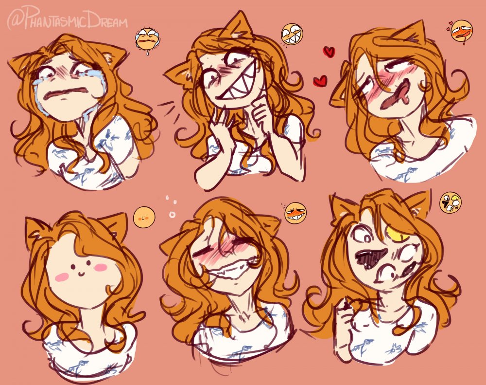
You're not stuck with the first sketch/concept. Sometimes we have to go through a few stages with in the sketching phase to figure out what we really want, and that's okay! Jump through as many sketch as you need, sometimes you need to go through some of the "bad ideas" to get to the "good ideas" Expressions are everything, they portray what the character's are feeling in their current situation that the scene is taking place. and how their expression is can make or break the scene. It can even change the scene completely. In one of the stages in the sketch here, we have Nurn'Kal (the Shadowling Ascendant) being rather calm, maybe having a little sass behind the eyes. But in the end, that wasn't what I was wanting for, I was wanting more of royally pissed off Ascendant. So, just the change of his mouth and a bit to the eyes gave me the look I was looking for! Here's another example of a few expressions. With the first and last one being rather similar in expression of being scared, while the middle one is just being annoyed of being in the situation. If you're unsure if the piece you're working on is going the way you're wanting it to go, take a break away from it. Set it aside to work on other things, and then come back to it with a fresh set of eyes!! Is the piece portraying the emotion you're wanting? If yes, then proceed as normal. If no, you can work on tweaking it. If you're unsure of what it's currently portraying, then ask a friend of their opinion on it. It can help having another viewer say what they're thinking of the piece to see if it aligns with what you're going for or not. Expressions!! How can you get better at drawing expressions? For a practice or for fun you can do up an expression chart for characters. Using a base or creating your own sort of "chart" layout, write out an expression for each section then draw a character of choice for each one. Maybe each character's expressions for emotions vary. One character's happy could be over the top, while another could be more calm and subtle. Even doing a progression chart for a sort of emotion could help you think about the different stages of the emotion. Here's an example of a blushing/flustered progression chart. References for expressions? If you find that you can't really portray the emotion you're thinking of, googling is you're friend! If you're thinking you just want to doodle emotions for character but don't have anything specific in mind? Look-up "Expression meme" and you'll come across a bunch of these over exaggerated expressions that you could or make a friend pick one out for you to try an draw yourself! There's like hundreds of them out there... it's insane. (randomly grabbed image) Here's an example of one I did up using Leaf's expression meme. Seeing these different approaches of emotions could help you better understand how to draw them, and how to exaggerate them if you're doing a more cartoon like style! •Variety is the spice of life•
-
Oh yays!! A new member to grace the forums with art!!
-
God Bless
-
And it's still the same green alien bastard. xD
-
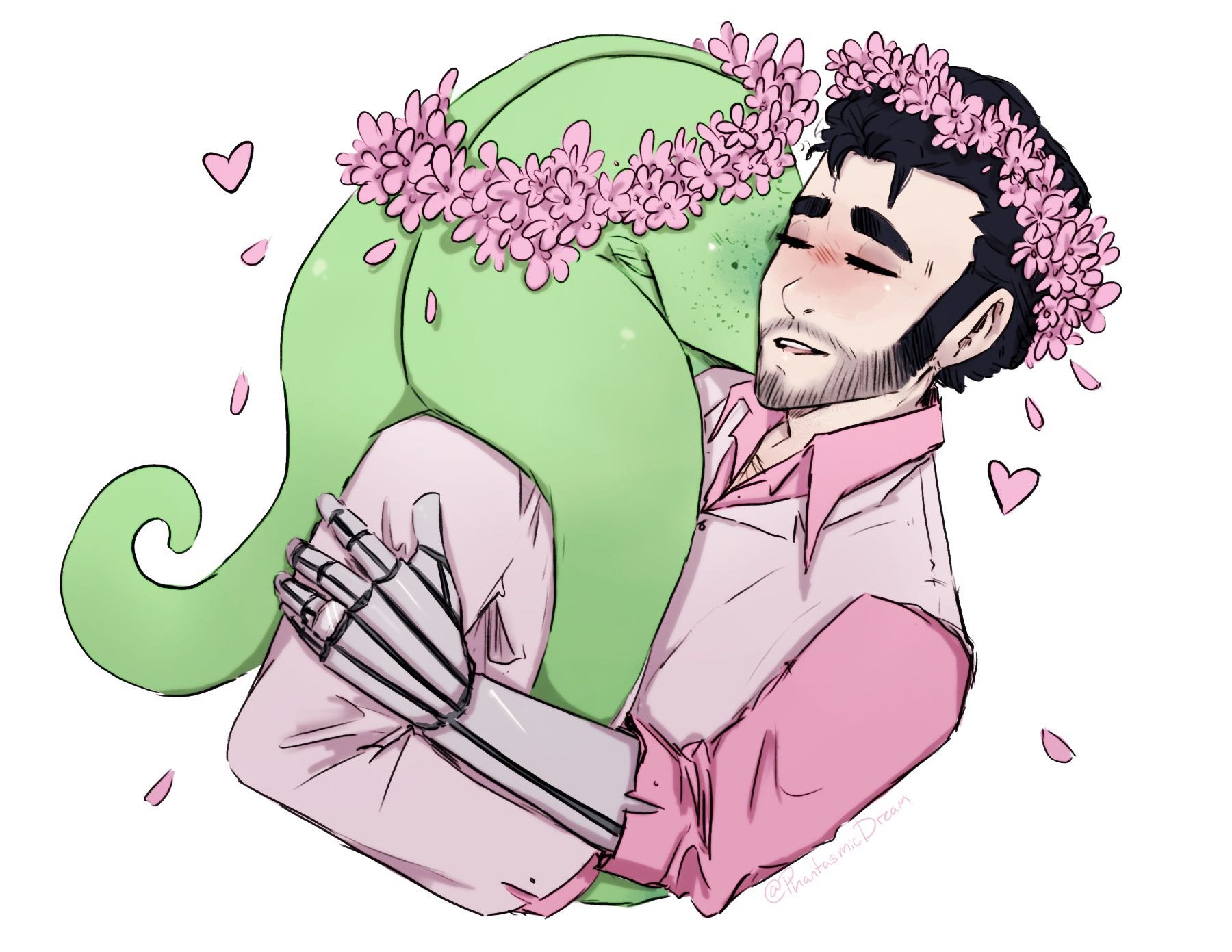
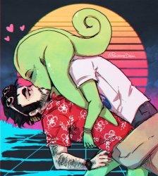
Drew something cute for Valentine's day, because I'm weak.

-
Aww, you flatter me.
-
I really like this file/ref-sheet kind of thing. i feel inspired.
-
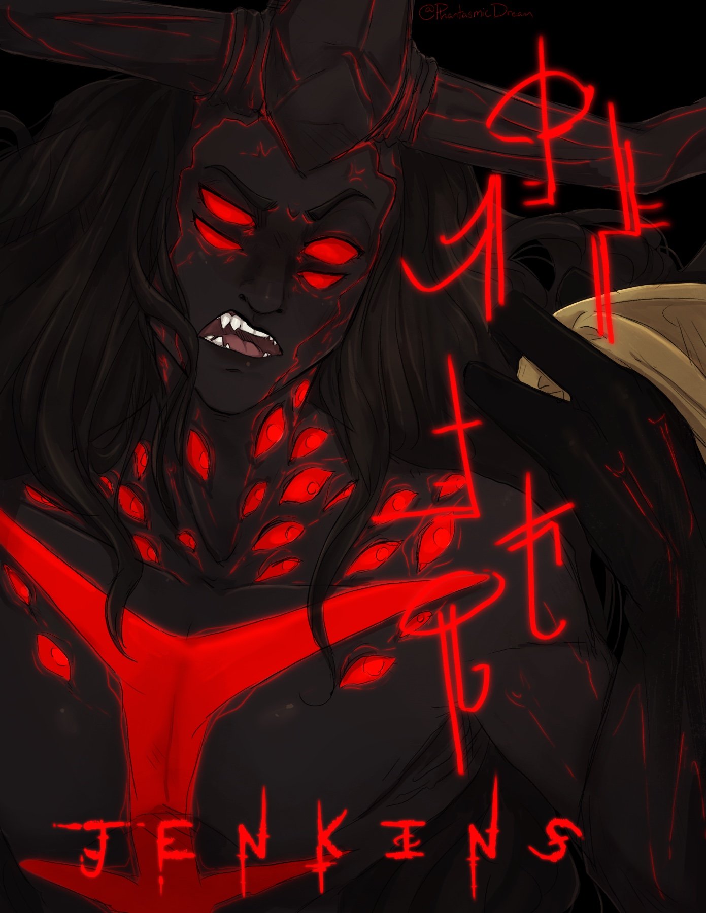
I had a thought of giving Shadowling Ascendants an alternate look they can take on having... More eyes and their claw like hands being darker/black. Why? Cause the aesthetic! So, here's Nurn'Kal being royally pissed off towards Jenkins. ^^'

-
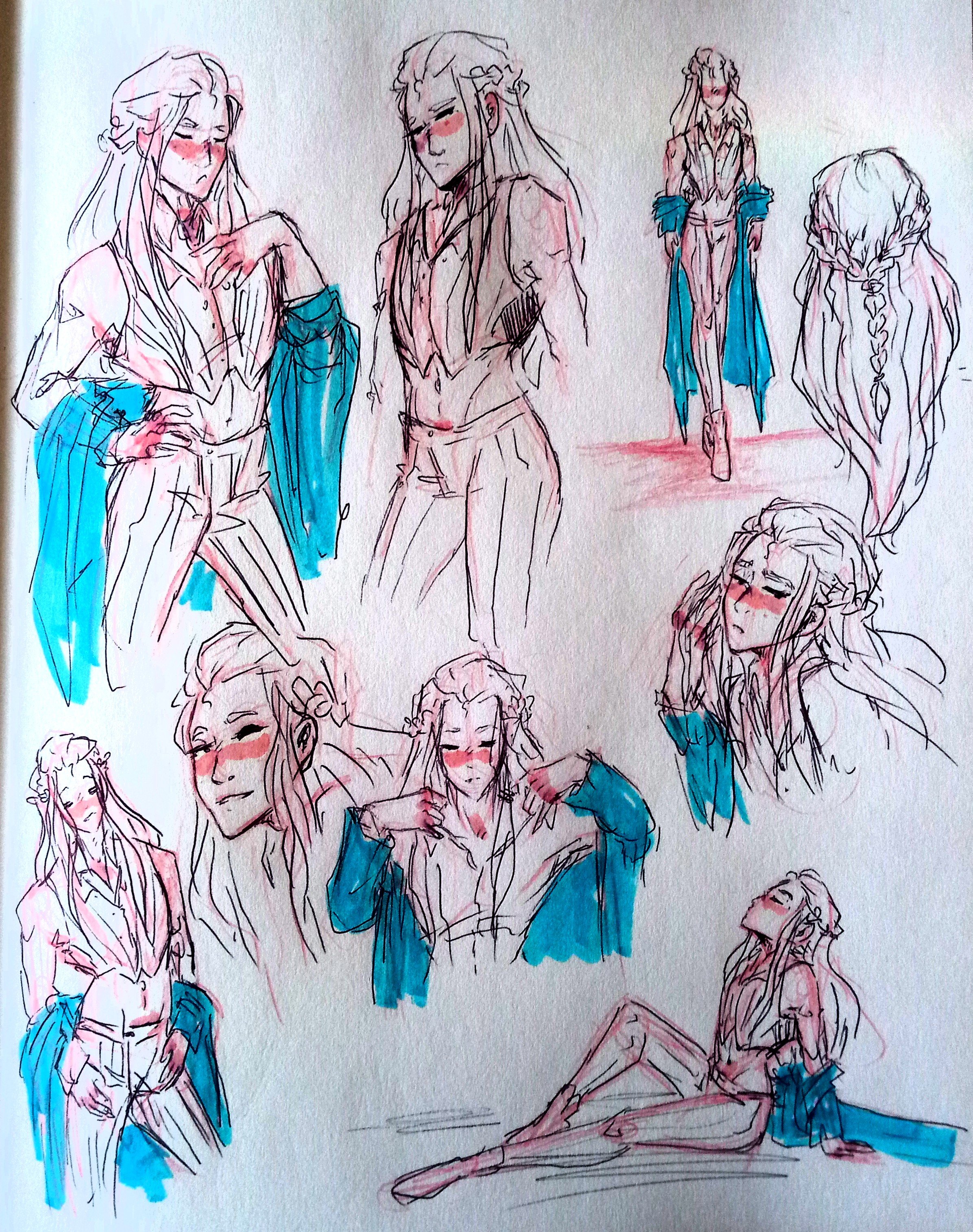
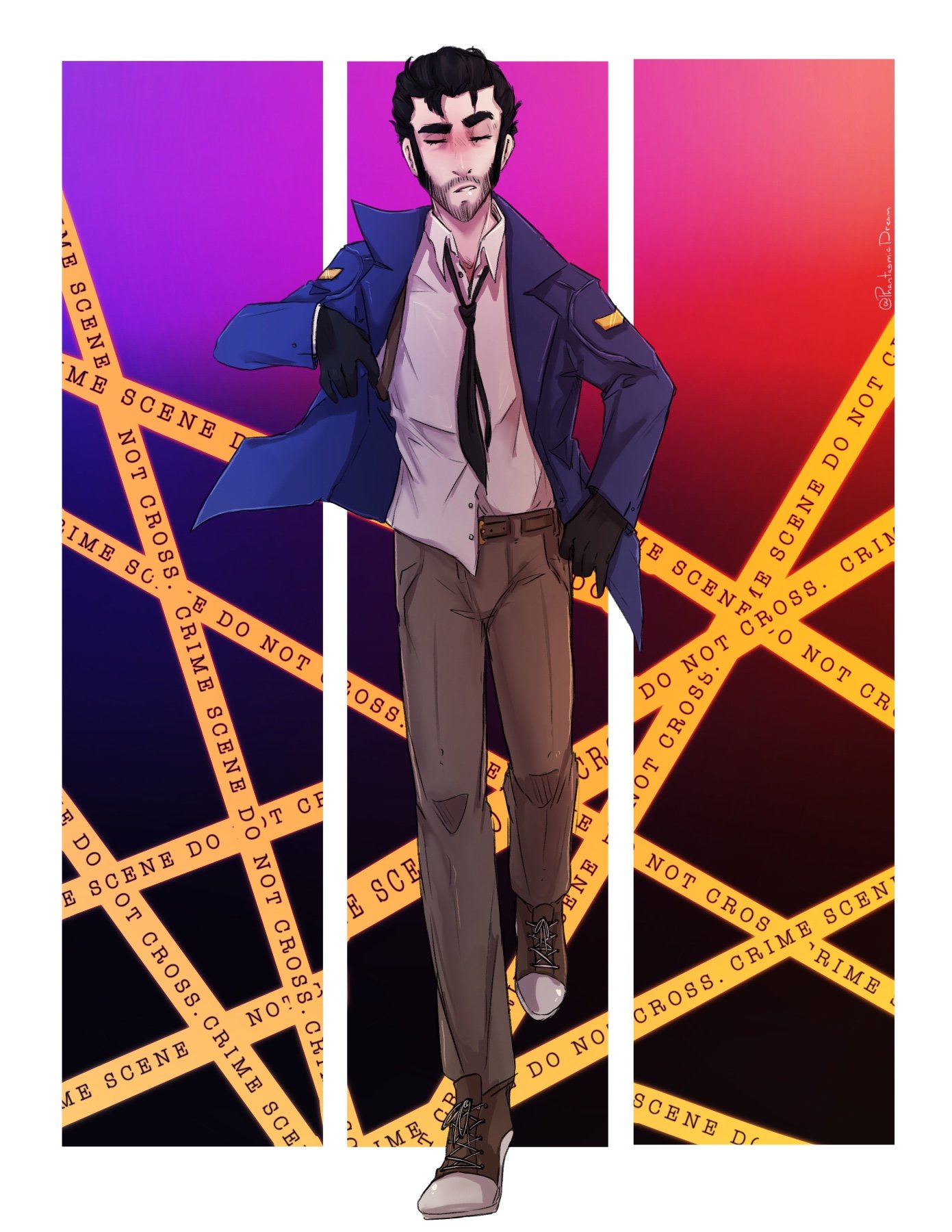
Just drawing my husband again... Normally I draw Jonah in the brown detective coat, but I came across this sort of post reference and thought I'd draw him in the blue coat for a change!

-
God? There is no God.
-
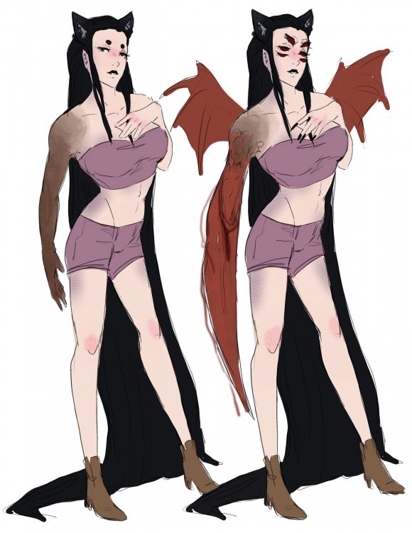
@Cazdon's OC donut steal

-
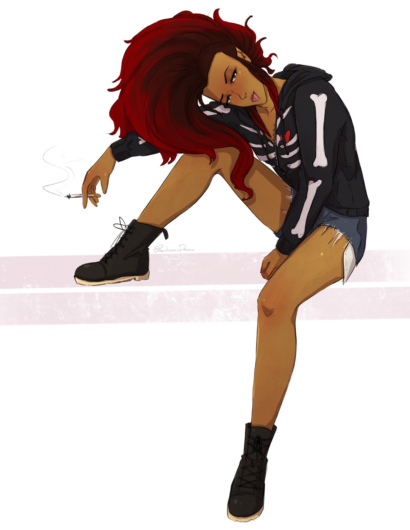
Felt like drawing a character of mine that I haven't drawn in a long time. Here's Colleen Blake, she's a pathological liar and enjoys writing poetry (which is normally bad)